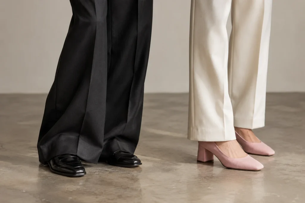
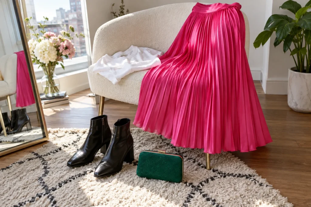
A useful wardrobe palette begins with evidence: the clothes you reach for, the shoes you can walk in, and the colors that make you want to get dressed. Start there, and the palette will help you use more of what you own.
It does not need to be restricted to beige, black, or white. Pink can be a core color if you wear it often. Denim can act as a neutral. A print you love can connect several shades that otherwise feel unrelated.
Pull ten frequently worn pieces
Choose clothing from the last few weeks, including the pieces that make ordinary days easier. Lay them out where you can see them together. Include shoes and your usual bag; they often explain why certain outfits work.
Sort the items into rough color groups. Do you see several blues, warm browns, strong pinks, or deep greens? Write down the colors that already repeat. Leave your rarely worn fantasy purchases out of this first exercise.
Give each color a job
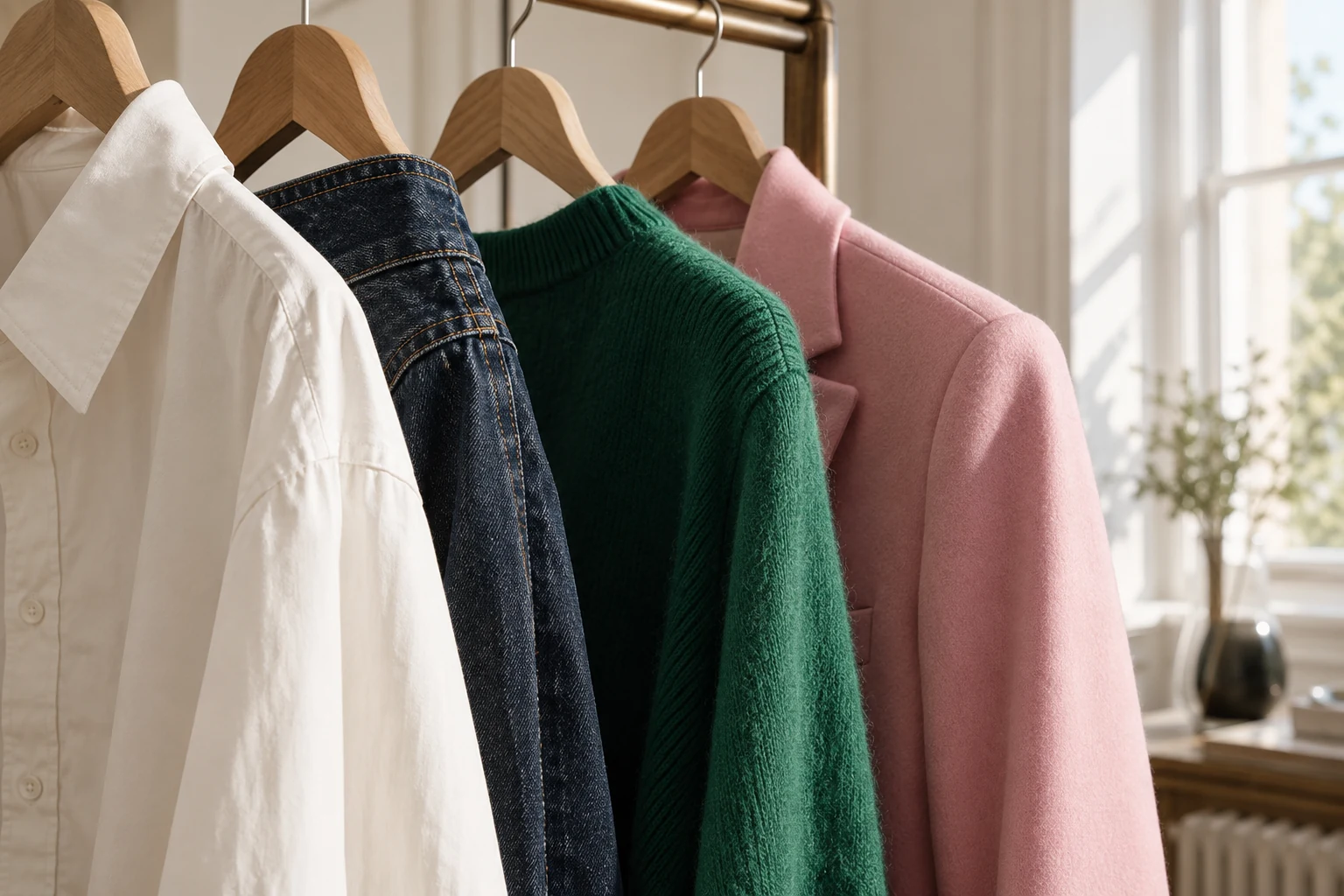
Choose two or three foundation colors that combine easily in your wardrobe. Then identify one or two accents you enjoy. An example might be ivory, black, and denim as the foundation, with pink and emerald as accents.
The roles can change. Someone who owns several pink jackets and dresses may treat pink as a foundation and use black for punctuation. A palette is a tool for making decisions, not a permanent rule about your personality.
Test actual combinations
Select one bottom and see how many tops work with it without needing another purchase. Repeat with a jacket and a dress. Aim for a few combinations that you would wear soon, rather than an impressive theoretical total.
If a favorite top works only with one pair of trousers, ask why. The obstacle may be shape, length, or formality instead of color. A palette cannot solve a waistband that feels uncomfortable or a jacket that pulls across your shoulders.
Use prints as connectors
A scarf containing pink, ivory, and green can make those colors feel related across an outfit. Choose one shade from the print for your main clothing, then repeat another in a smaller detail. You do not need to match every color in the pattern.
For a quieter approach, keep the print small and let most of the outfit remain solid. For a stronger look, make the printed piece the lead and simplify the accessories.
Keep a small visual record
Create a phone album with five outfits that work. The photographs will be more useful than a list of abstract color names when you are considering a new piece. Ask which existing outfits it would join and whether it solves a real need.
Review the palette when your season, work routine, or preferences change. Add a color because you enjoy wearing it, and remove one if it has stopped earning space. The wardrobe belongs to the person living in it now.
Keep reading
- The Wardrobe Gap Test: What Is Actually Missing?
- The Sunday Wardrobe Reset: Twenty Minutes for an Easier Week
Have a style question? Ask Kim, or join the conversation on Instagram.