Corridor Partners with Pantone To Create Sustainable Digital Creation Process

Pantone LLC, the global authority on color and provider of professional color tools for designers, announced its partnership with menswear brand, Corridor, to streamline it’s color and design process with Pantone Fashion, Home + Interiors (FHI) integrated design solution. Corridor, an independent menswear brand, focuses on contemporary American clothing, natural fibers, and responsible design and tailoring. Corridor leveraged Pantone’s FHI tools to create a portable, global design ecosystem in response to the accelerated need for designers to adapt to a new workflow amidst COVID-19.
The evolution of the manufacturing process in design has increasingly become more digital as calls for a more sustainable process – i.e. cutting down on waste and carbon emissions traditionally generated in the sampling process, has become a major priority in the fashion and home furnishings industries as a whole. In addition, the pandemic has shifted the way people work and communicate in design, limiting travel, and enforcing communication digitally. As a result, designers have had to fill in the gaps of communication for color and creation through a seamlessly integrated process leveraging physical and digital design tools.
Dan Snyder, the creator of Corridor, wanted to remain committed to the brand’s focus on “making beautiful things” despite these new shifts and needed a mobile color development process that would allow him to convert the beauty he saw while in nature into something that could be communicated with his global suppliers. Snyder was able to create his own portable design ecosystem that adapted to his design needs using Pantone’s Fashion, Home + Interiors product suite. Snyder began his process by using the Pantone Connect mobile app, which provides digital access to all the Pantone libraries, to capture his inspirations, creates the perfect color harmonies, and translates them into Pantone colors. Additionally, Snyder needed to communicate these colors to his global suppliers and did so by using the Pantone FHI Cotton Planner and Cotton Swatch Card standards. With this integrated design solution, Dan was not only able to convert his inspiration from nature into fashion, but also create major cost savings and waste reduction as a result.
“Using the Pantone FHI system has doubled the speed of our design process and cut costs significantly. Normally, we would need 4-5 strike-offs/dyes in order to hit our color. With Pantone, we typically achieve the color we need in the first dye lot. Additionally, using the Pantone Connect app in combination with swatch cards, we are able to clearly communicate with our dye house/factory on the agreed color and as a result, have been able to reduce waste and carbon emissions by not shipping fabrics across the world. We are extremely excited to be working with Pantone and feel equipped to handle our increasingly digital workflow,” says Dan Snyder, Corridor.
With color accuracy being at the forefront of Pantone’s capabilities, Pantone’s Fashion, Home, + Interiors design tools offer:
  • Over 3,000 colors curated specially for the Fashion, Home + Interiors market ensuring market relevance. The Pantone Fashion, Home + Interiors color standards are available in multiple formats, including cotton, polyester, nylon, paint-on-paper, and metallic.
  • A wide range of color and design solutions meet evolving design needs. Whether it’s designing a new fashion collection from the kitchen counter or a limited-edition footwear line with a business partner 500 miles away, Pantone has the tools to fit every designer’s needs. The Pantone Fashion, Home + Interior product line offers color tools for working from home, the studio, and even the production floor. Not only are the FHI tools equipped to support unique physical workspaces, but also each tool includes digital complements to connect your designs and your teams globally.
  • New design technologies that enable new color innovations. Having digital access to each of Pantone’s entire collection of colors enables designers to seamlessly streamline digital and physical workflows. Spectral data support ensures fast turnaround and accurate, on-schedule production.
“While digital transformation has continually been a discussion, the industry needed to adapt faster than anticipated to provide a more efficient and sustainable process for the way we work today. Pantone is dedicated to creating an environment where designers can have integrated solutions that will enable them to easily shift between physical and digital design whenever and wherever needed. With Pantone being the global language and translator of color, we are excited to continue to innovate alongside our fellow designers and be the go-to partner for all creatives at every step of their process – from inspiration to creation,” says Shantel Sullivan (Pantone FHI Product Manager)
To provide designers with color tools and understanding to cope with the evolution of the creation process in design, Pantone will also be introducing a spotlight series on the Future of Work in design through additional designer partnerships, workshops, and conversations with the design community to discuss the tension points in their process, how the color and design process has evolved, as well as trends that have emerged in this new age and the best way to communicate color as a result.
About Pantone
Pantone provides a universal language of color that enables color-critical decisions through every stage of the workflow for brands and manufacturers. More than 10 million designers and producers around the world rely on Pantone products and services to help define, communicate and control color from inspiration to realization – leveraging advanced X-Rite technology to achieve color consistency across various materials and finishes for graphics, fashion, and product design. Pantone Standards feature digital and physical color specification and workflow tools. The Pantone Color Institute™ provides customized color standards, brand identity and product color consulting as well as trend forecasting inclusive of Pantone Color of the Year, Fashion Runway Color Trend Reports, color psychology and more. Pantone B2B Licensing incorporates the Pantone Color System into different products and services, enabling licensees to communicate and reproduce approved Pantone values and improve efficiencies for their users. Pantone Lifestyle brings color and design together across apparel, home, and accessories. Connect with Pantone on InstagramFacebookLinkedIn.
About X-Rite
Founded in 1958, X-Rite Incorporated is a global leader in the science and technology of color and appearance. With Pantone, X-Rite employs more than 800 people in 11 countries. The company’s corporate headquarters are located in Grand Rapids, Mich., with regional headquarters in Europe and Asia and service centers across Europe, the Middle East, Asia, and the Americas. X-Rite offers a full range of solutions used by manufacturers, retailers, printers, photographers, and graphic design houses to achieve precise management and communication of color and appearance throughout their processes. X-Rite products and services are recognized standards in the printing, packaging, photography, graphic design, video, automotive, paints, plastics, textiles, and medical industries. For further information, please visit www.xrite.com. For the latest news, information, connect with X-Rite on LinkedInTwitter, and Facebook.

The Pantone Color of the Year 2020 Is Officially Classic Blue

Pantone, a provider of professional color language standards and digital solutions, and X-Rite Incorporated today announced PANTONE 19-4052, Classic Blue, as the Pantone® Color of the Year for 2020; a timeless and enduring hue elegant in its simplicity. Suggestive of the sky at dusk, the reassuring qualities of the thought-provoking. PANTONE 19-4052 Classic Blue highlights our desire for a dependable and stable foundation from which to build as we cross the threshold into a new era.

“We are living in a time that requires trust and faith. It is this kind of constancy and confidence that is expressed by PANTONE 19-4052 Classic Blue, a solid and dependable blue hue we can always rely on,” said Leatrice Eiseman, Executive Director of the Pantone Color Institute. “Imbued with a deep resonance, PANTONE 19-4052 Classic Blue provides an anchoring foundation. A boundless blue evocative of the vast and infinite evening sky, PANTONE 19-4052 Classic Blue encourages us to look beyond the obvious to expand our thinking; challenging us to think more deeply, increase our perspective and open the flow of communication.”

Imprinted in our psyches as a restful color, PANTONE 19-4052, Classic Blue brings a sense of peace and tranquility to the human spirit, offering refuge. Aiding concentration and bringing laser-like clarity, PANTONE 19-4052, Classic Blue re-centers our thoughts. A reflective blue tone, Classic Blue fosters resilience.

As technology continues to race ahead of the human ability to process it all, it is easy to understand why we gravitate to colors that are honest and offer the promise of protection. Non-aggressive and easily relatable, the trusted PANTONE 19-4052, Classic Blue lends itself to relaxed interaction. Associated with the return of another day, this universal favorite is comfortably embraced.

“The Pantone Color of the Year highlights the relationship between trends in color and what is taking place in our global culture at a moment in time, a color that reflects what individuals feel they need that color can hope to answer.” added Laurie Pressman, Vice President of the Pantone Color Institute. “As society continues to recognize color as a critical form of communication, and a way to express and affect ideas and emotions, designers and brands should feel inspired to use color to engage and connect. The Pantone Color of the Year selection provides strategic direction for the world of trend and design, reflecting the Pantone Color Institute’s year-round work doing the same for designers and brands.”

To fully bring to life the true meaning of PANTONE 19-4052 Classic Blue, Pantone has translated PANTONE 19-4052 Classic Blue into a multi-sensory experience. By extending the sensory reach of PANTONE 19-4052 Classic Blue, Pantone is hoping to reach a greater diversity of people to provide everyone with an opportunity to engage with the Color of the Year 2020 in their own unique way.

“As we all head into a new era, we wanted to challenge ourselves to find inspiration from new sources that not only evolve our Color of the Year platform but also help our global audiences achieve richer and more rewarding color experiences,” added Pressman. “This desire, combined with the emotional properties of PANTONE 19-4052 Classic Blue, motivated us to expand beyond the visual, to bring the 2020 Pantone Color of the Year to life through a multi-sensory experience.”

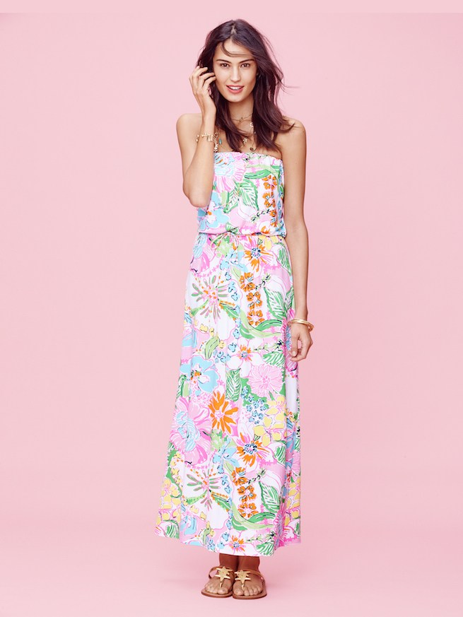
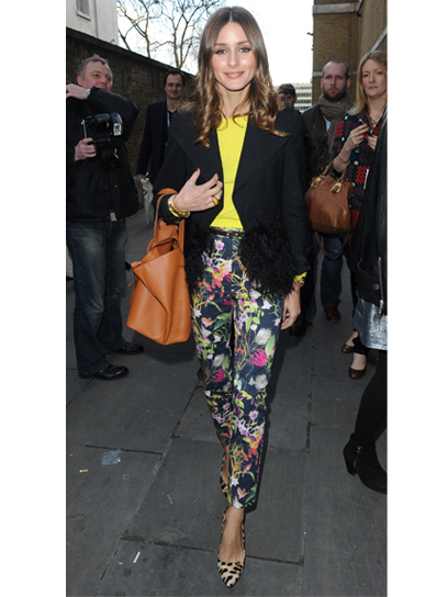
Classic Blue in Fashion

PANTONE 19-4052 Classic Blue is a poised and self-assured blue hue elegant in its simplicity. Genderless in outlook and seasonless in endurance, this foundational anchor shade enables color mixes throughout the spectrum, as well as making a strong statement on its own. Emblematic of heritage but at the same time highly contemporary, versatile PANTONE 19-4052 Classic Blue takes on distinct appearances through application to different materials, finishes and textures from shimmering metallics, lustrous sheens and high-tech materials to handcrafted looks and more fragile fabrics.

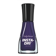
Classic Blue in Beauty

In the ultimate display of personal expression, PANTONE 19-4052 Classic Blue makes a dramatic statement for eyes, nails, and hair in a variety of finishes from glittery and glam to dusty matte.

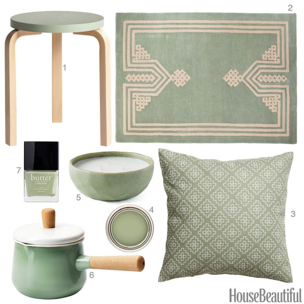
Classic Blue in Home Décor

Offering the promise of protection PANTONE 19-4052 Classic Blue is a pervasive favorite for home. Creating a stable foundation from which to build, PANTONE 19-4052 Classic Blue injects creative confidence into interiors, transforming space through unique color combinations and tonal statements. Easily applied across so many different materials, textures and finishes, PANTONE 19-4052 Classic Blue is a dependable blue that can take you in different directions expressing tradition and elegance as well as unexpected boldness.

Classic Blue in Graphic Design and Packaging

Because of PANTONE 19-4052 Classic Blue’s relation to the sky at dusk, something we see every day, it maintains a perception of dependability and constancy. A color we respond to viscerally as being trustworthy, PANTONE 19-4052 Classic Blue is an ideal shade for many applications of graphic design. This is especially true for packaging where PANTONE 19-4052 Classic Blue conveys the message of honesty, credibility, and reliability that today’s consumers are connecting to.

Classic Blue in Food and Beverage

Blue foods and beverages including PANTONE 19-4052 Classic Blue like shades are rich in anthocyanins. With this relationship to wellness and self-care, these blue foods help to build a solid foundation, acting as a form of protection for good health. In addition to their natural health benefits, these blue foods also bring style and sophistication to the table.

Classic Blue as a Multi-Sensory Experience

In addition to releasing the iconic Pantone color swatch for PANTONE 19-4052 Classic Blue, Pantone has collaborated with a number of sensory experts from the worlds of music, food, fashion, beauty and technology to envision PANTONE 19-4052 Classic Blue as a sound, a smell, a taste, and a feeling. Taken together, all of these sensory inputs have been designed to inspire creatives and consumers to think about color differently, to uncover new patterns and associations, and to encourage them to create new experiences that speak to people’s hearts as well as their minds. Members of the media can request a free, limited edition, Pantone Color of 2020 Multi-Sensory Kit by emailing PantonePR@Hugeinc.com.

Pantone Sensory Partners:

  • ADOBE X PANTONE COLOR OF THE YEAR

Pantone has partnered with Adobe Stock to offer a handpicked Color of the Year collection of imagery to inspire creators and bring color to life. Classic Blue, Pantone’s choice for 2020, evokes calm confidence, connection, and a sense of thoughtful stability as we embark on our next decade. With millions of visual assets, from still photography and design templates to fresh 3D and motion graphics, Adobe Stock is an endless resource for creatives seeking visual inspiration and essential design components. https://stock.adobe.com

See the Adobe Stock/ Pantone Classic Blue gallery here:

https://stock.adobe.com/collections/jKy3Dg4a9DFE12Y2LdTxFC7l1UHPc9KC

  • ARTECHOUSE X PANTONE COLOR OF THE YEAR 

The nation’s first digital art destination, ARTECHOUSE creates innovative, one-of-a-kind technology-driven exhibitions and installations, across the United States. Their new, permanent New York space, located in a 100-year-old boiler room in Chelsea Market will serve as the backdrop of our official Color of the Year 2020 announcement to media and influencers across design and creative industries. Inspired by the tranquility and calming effects of PANTONE 19-4052 Classic Blue, Pantone collaborated with ARTECHOUSE and their creative team to produce a unique, fully immersive, multi-sensory reveal.

  • AUDIO UX X PANTONE COLOR OF THE YEAR

Audio UX, a next-gen audio branding agency, partnered with Pantone to create the sound of PANTONE 19-4052 Classic Blue. The sound builds on the timelessness and enduring nature of PANTONE 19-4052 Classic Blue, as our hearts call for a nostalgic song that takes us to a place of comfort and familiarity. The sound, named “Vivid Nostalgia” utilizes traditional instruments treated in innovative ways, bridging the gap between past and present. https://auxnyc.com/.

  • FEDEX OFFICE X PANTONE COLOR OF THE YEAR 

Color inspires and brings storytelling to life for brands and consumers in many ways – from business cards, banners, presentations, textured graphics and much more. FedEx Office will bring PANTONE 19-4052 CLASSIC BLUE to life through the creation of a multidimensional installation within the launch experience using its state-of-the-art color matching and print technology. Businesses including Pantone and consumers trust FedEx Office to ensure the right color will be printed every time. https://www.fedex.com/en-us/office.html.

  • FIRMENICH X PANTONE COLOR OF THE YEAR

Pantone partnered with Firmenich, the world’s largest privately-owned fragrance and flavor company. Together with Firmenich, Pantone created the essence of “taste” and “smell” of PANTONE 19-4052 Classic Blue. The taste of PANTONE 19-4052 Classic Blue holds the experiential smell of fresh green, the initial taste of fruity sweet berry, and the final finish of floral and Classic Blue notes. The smell of PANTONE 19-4052 Classic Blue is a fragrant contemplation of where sky and sea meet – a boundless blue where there is no end. https://www.firmenich.com/.

  • THE INSIDE X PANTONE COLOR OF THE YEAR 

Pantone partnered with The Inside, a digitally native home furnishings brand, to develop a custom Color of the Year 2020 fabric that tactilely embodies the spirit of PANTONE 19-4052 Classic BlueThe touch of PANTONE 19-4052 Classic Blue was inspired by its transitional quality, and how that manifests in the sky at dusk. Classic blue translates into a soft, velvety texture to print on, further emphasizing the comforting quality of this year’s Color of the Year. The custom fabric will be available for a limited time to purchase on a select number of The Inside’s furnishings and decor. https://www.theinside.com/.

  • LANDR X PANTONE COLOR OF THE YEAR

In collaboration with Audio UX, LANDR, the creative platform for musicians, worked as Pantone’s audio partners to help create The Classic Blue Sample Pack, a conceptual audio embodiment of Classic Blue that explores the multi-sensorial experience of sound and color as one. The sample pack consists of 200 different samples and loops that bring PANTONE 19-4052 Classic Blue to life, and aims to inspire artists to make their best music. The sound pack is available on LANDR here: INSERT LINK.

  • TEALEAVES X PANTONE 

Partnering with Pantone in curating colorful experiences since 2015, TEALEAVES, the luxury tea blender of choice for Michelin-star Chefs and 5-Star hotels worldwide, created the official bespoke tea blend to harmonize the color, aroma, and taste of PANTONE 19-4052 Classic Blue. Inspired by the rich symbolism associated with the color, TEALEAVES’ master blenders have used the highest-grade botanicals to create a wellness-oriented, elegant, and expansive berry mélange with subtle citrus notes. The Pantone Color of the Year 2020 Tea Blend is the epitome of a perfect palate expression of the color, created through the art of blending. https://www.tealeaves.com/.

Limited Edition Pantone Color of the Year 2020 Guides 

Pantone will also release limited-edition collections of Pantone Color of the Year 2020 Formula Guides and Fashion, Home + Interiors Color Guides as collector’s items for designers, to help them better integrate Classic Blue into their workflow and drawing the connection between the inspiration that the Color of the Year offers to the color achievability and consistency that Pantone standards ensure. Guides will feature a specialized Color of the Year cover including messaging for Classic Blue enclosed within the guide. Available at on Pantone.com, these guides are perfect gifts for designers who are already on the pulse of color trends, or for up-and-comers who want to deck out their desk with the sleekest tools.

Pricing:

  • Pantone Color of the Year 2020 Formula Guide (Coated & Uncoated): SRP $179
  • Pantone Color of the Year 2020 Fashion, Home + Interiors Color Guide: SRP $210

Pantone Connect for Designing Digitally with Classic Blue

Pantone Connect, a time-saving color extension for Adobe Creative Cloud®, includes five different pre-loaded color palettes featuring Classic Blue. These Color of the Year-themed palettes, along with every other Pantone Color, are available to browse through and integrate directly into design files within Adobe Photoshop®, Illustrator®, and InDesign®. Pantone Connect also offers designers an easy way to convert to Pantone from non-Pantone colors and collaborate on palettes with teammates. Download Pantone Connect to start designing with Classic Blue today.

About the Pantone Color of the Year

The Color of the Year selection process requires thoughtful consideration and trend analysis. To arrive at the selection each year, Pantone’s color experts at the Pantone Color Institute comb the world looking for new color influences. This can include the entertainment industry and films in production, traveling art collections and new artists, fashion, all areas of design, popular travel destinations, as well as new lifestyles, playstyles, and socio-economic conditions. Influences may also stem from new technologies, materials, textures, and effects that impact color, relevant social media platforms and even up-coming sporting events that capture worldwide attention. For 21 years, Pantone’s Color of the Year has influenced product development and purchasing decisions in multiple industries, including fashion, home furnishings, and industrial design, as well as product packaging and graphic design. Past selections for Color of the Year include:

  • PANTONE 16-1546 Living Coral (2019)
  • PANTONE 18-3838 Ultra Violet (2018)
  • PANTONE 15-0343 Greenery (2017)
  • PANTONE 15-3919 Serenity and PANTONE 13-1520 Rose Quartz (2016)
  • PANTONE 18-1438 Marsala (2015)
  • PANTONE 18-3224 Radiant Orchid (2014)
  • PANTONE 17-5641 Emerald (2013)
  • PANTONE 17-1463 Tangerine Tango (2012)
  • PANTONE 18-2120 Honeysuckle (2011)
  • PANTONE 15-5519 Turquoise (2010)
  • PANTONE 14-0848 Mimosa (2009)
  • PANTONE 18-3943 Blue Iris (2008)
  • PANTONE 19-1557 Chili Pepper (2007)
  • PANTONE 13-1106 Sand Dollar (2006)
  • PANTONE 15-5217 Blue Turquoise (2005)
  • PANTONE 17-1456 Tigerlily (2004)
  • PANTONE 14-4811 Aqua Sky (2003)
  • PANTONE 19-1664 True Red (2002)
  • PANTONE 17-2031 Fuchsia Rose (2001)
  • PANTONE 15-4020 Cerulean (2000)

The color selected as our Pantone Color of the Year 2020 was taken from the Pantone Fashion, Home + Interiors Color System, the most widely used and recognized color standards system for fashion, textile, home, and interior design.

For more information on the Pantone Color of the Year for 2020, please visit www.pantone.com/color-of-the-year-2020.

About The Pantone Color Institute™

The Pantone Color Institute is the business unit within Pantone that highlights the top seasonal runway colors, selects the Pantone Color of the Year, forecasts global color trends, and advises companies on color for product and brand visual identity. Through seasonal trend forecasts, color psychology, and color consulting, the Pantone Color Institute partners with global brands to effectively leverage the power, psychology, and emotion of color in their design strategy.

About Pantone

Pantone provides the universal language of color that enables color-critical decisions through every stage of the workflow for brands and manufacturers. More than 10 million designers and producers around the world rely on Pantone products and services to help define, communicate and control color from inspiration to realization – leveraging advanced X-Rite technology to achieve color consistency across various materials and finishes for graphics, fashion and product design. Pantone Standards feature digital and physical color specification and workflow tools. The Pantone Color Institute™ provides customized color standards, brand identity and product color consulting as well as trend forecasting inclusive of Pantone Color of the Year, Fashion Runway Color Trend Reports, color psychology and more. Pantone B2B Licensing incorporates the Pantone Color System into different products and services, enabling licensees to communicate and reproduce certified Pantone values and improve efficiencies for their users. Pantone Lifestyle brings color and design together across apparel, home, and accessories. Learn more at www.pantone.com and connect with Pantone on Instagram, Facebook, Pinterest, and LinkedIn.

About X-Rite

Founded in 1958, X-Rite Incorporated is a global leader in the science and technology of color and appearance. With Pantone, X-Rite employs more than 800 people in 11 countries. The company’s corporate headquarters are located in Grand Rapids, Mich., with regional headquarters in Europe and Asia and service centers across Europe, the Middle East, Asia, and the Americas. X-Rite offers a full range of solutions used by manufacturers, retailers, printers, photographers and graphic design houses to achieve precise management and communication of color and appearance throughout their processes. X-Rite products and services are recognized standards in the printing, packaging, photography, graphic design, video, automotive, paints, plastics, textiles and medical industries. For further information, please visit www.xrite.com. For the latest news, information, connect with X-Rite on LinkedInTwitter, and Facebook.

Keep Clothes Bright and Less Fading – Laundry Secrets from Downy Ball

Surveys show that Americans spend a decent amount of money on clothing. Women spend about $59 and men spend about $25 a month. The average family bringing in an income of $50,000 spends about $2,000 a year on new outfits. On top of the money being invested in new shirts, pants, sweaters and other garments, laundry can be a real pain in the neck. Stain removers don’t always eliminate the entire mark left behind by spilled coffee or mystery smears, and color-enhancing detergent only extends the lifetime of clothing for so long. To help prevent having to purchase new clothes there are tips to help keep darks from fading, sneakers from tumbling into pieces in the dryer and white shirts from having ugly armpits.

0037000357160_A1L1_ItemMaster_type_large

Downy Ball has compiled some of the best laundry secrets and shortcuts since the invention of the modern washing machine and dryer to help consumers look their best with minimal effort. These tips include:

  1. Buy a sneaker dryer bag to eliminate the loud banging from your shoes.
  1. To prevent color fading, toss your clothes in the wash with a teaspoon of salt for a brighter look.
  1. Wash dark clothes inside out to keep them from fading. The detergent won’t drain the color and this easy trick will keep favorite shirts and pants looking newer longer.
  1. Save time, energy and money by throwing a dry towel into the dryer with wet laundry – this will reduce moisture in the machine and speed up the drying process.
  1. Remove underarm stains with a homemade recipe instead of bleach or stain sticks. Mix Dawn dishwashing liquid, hydrogen peroxide, and baking soda to create a scrub that gets stunning results.
  1. Remove grease stains with a piece of chalk. Even if you have already washed a garment hoping soap and water would do the trick, that stain isn’t a permanent part of your wardrobe and chalk can still save the day.

[youtube height=”720″ width=”1280″]watch?v=Fhp6bRjj-iM[/youtube]

About Downy Ball

No more waiting for the rinse cycle. No more cleaning out the dispenser. With the Downy Ball, fabric softener is automatically released during the rinse cycle. To enjoy the convenience of Downy Ball just pour the Downy fabric softener of choice up to the right fill line in the Downy bottle cap, pour into the ball, seal it, and drop it in at the start of the wash on top of fabrics. Downy Ball will release the softener on its own, making laundry less complicated.

IMG_3060

Shoedazzle Color Of The Month – Daffodil Accessories

Daffodil is considered the new Shoedazzle color of the month.  The accessories brand has an array of Daffodil inspired handbags, jewelry, and shoes.  First Lady, Michelle Obama wore a similar shade in a beautiful sheath dress.  This inspired women to wear the hue while adding a pop of color into their wardrobe.

FullSizeRender-72 FullSizeRender-75

It’s the perfect Spring shade because this color mixes (and matches) well with every fashion piece. Trendsetters and Style Bloggers are seen wearing Daffodil colored eyeshadow, nail polish, and hair accessories.

IMG_2987

15c276aa21aff9c36131cf673591e762

FullSizeRender-73

For an everyday look, pair (Daffodil) yellow accessories with a jumpsuit, jeans, or basic t-shirt.  Color trends are fun to wear but don’t forget to make the style your own!

Sally Hansen Fall 2015 Designer Inspired Shades

The new Sally Hansen much anticipated fall 2015 designer inspired shades from Prabal Gurung, Tracy Reese, Rodarte.

 page1image1152

For

page1image24384

THE DESIGNER

Prabal Gurung launched his eponymous collection in February 2009 with a philosophy encompassing modern luxury, bold femininity and an astute sense of glamour.

Gurung was born in Singapore and raised in Kathmandu, Nepal. After beginning his design career in New Delhi he moved to New York to finish his studies at Parsons The New School for Design. Upon graduating, Gurung spent two years with Cynthia Rowley’s design and production teams. Soon after, he was appointed design director at the iconic Bill Blass, a post he held for five years until launching his own collection, PRABAL GURUNG.

A focus on quality and innovation has placed Gurung at the forefront of American fashion with designs worn by leading ladies including First Lady Michelle Obama and The Duchess of Cambridge, to name a few. In 2010 he was the recipient of the Ecco Domani Fashion Fund Award and selected as runner up for the 2010 CFDA / Vogue Fashion Fund. In 2011 Gurung was honored as one of USA Network’s Character Approved Award recipients, named goodwill ambassador of Maiti Nepal, a finalist of the Cooper-Hewitt National Design Award and was the recipient of the 2011 CFDA Swarovski Award for Womenswear. Prabal Gurung was the official 2013 designer collaborator for Target and in September 2014 launched footwear on the Spring 2015 runway.

THE PARTNERSHIP

Prabal Gurung collaborated with Sally Hansen for the tenth consecutive season to create three exclusive nail polish shades to compliment his Fall 2015 collection, which is a graphic, modern take on effortless glamour.

THE SHADES

The exclusive Prabal Gurung for Sally Hansen collection includes: Complete Salon Manicure in Midnight Affair, Complete Salon Manicure in Leaf Peeper,  Complete Salon Manicure in Concrete Jungle

unnamed

SallyHansen

SallyHansen2

These three custom colors can be found in Sally Hansen’s award-winning Complete Salon Manicure collection that infuses trend-setting shades with an expert quality formula to deliver salon-caliber results. Sally Hansen Complete Salon Manicure delivers seven salon manicure steps in one bottle. Chip resistant strength joins gel-quality shine. Must-have color meets nourishing benefits. Plus, a built-in base and top coat, it’s everything you need to achieve a professional manicure at home. These three limited-edition colors will be available beginning September 2015 for $7.99 each.

page1image672

FOR

page1image21816

THE DESIGNER

With an innate desire to create beautiful things, Detroit native Tracy Reese headed for Manhattan in 1982 to attend Parsons School of Design where she received an accelerated degree in 1984. Upon graduation, Reese apprenticed under designer Martine Sitbon while working for the small contemporary firm, Arlequin. Reese has also worked at the some of the industry’s top fashion houses, including Perry Ellis where she was the design director for Women’s Portfolio.

In 1996, Reese launched her eponymous collection to rave reviews. Perfect for the modern woman, Reese’s debut showcased ultra-feminine, polished pieces layered with intelligent nostalgia, charm and glamour; a distinctive look that the designer has since become known for.

A member of the CFDA since 2000, Reese has severed as a member of the Board of Directors since 2007. She is also a key player in selecting recipients to receive grants from the CFDA’s AIDS-Fund initiatives.

THE PARTNERSHIP

For the nineteenth consecutive season, Tracy Reese collaborated with nail color leader Sally Hansen to create three exclusive nail colors that complemented her Fall 2015 Collection.

THE SHADES

The exclusive Tracy Reese for Sally Hansen collection includes: Complete Salon Manicure in Yummy Yam,  Complete Salon Manicure in Maasai Red,  Complete Salon Manicure in Winter Sky.

SallyHansen5 SallyHansen4 SallyHansen3

These three colors can be found in Sally Hansen’s award-winning Complete Salon Manicure collection that infuses trend-setting shades with an expert quality formula to deliver salon-caliber results. Sally Hansen Complete Salon Manicure delivers seven salon manicure steps in one bottle. Chip resistant strength joins gel- quality shine. Must-have color meets nourishing benefits. Plus, a built-in base and top coat, it’s everything you need to achieve a professional manicure at home. These three limited-edition colors will be available beginning September 2015 for $7.99 each.


unnamed (44)


Inspired

unnamed (45)


THE DESIGNERS

Sisters Kate and Laura Mulleavy launched Rodarte in 2005 and quickly became known as the go-to house for couture, known for their intricate hand stitching and romantic details.  They have won numerous fashion awards such as the 2008 CFDA Swarovski Emerging Womenswear Designer award and the 2008 Swiss Textiles Award.  Leading ladies like Cate Blanchett, Natalie Portman, Keira Knightley, Kirsten Dunst, Michelle Obama, Chloe Sevigny, Tilda Swinton, Elle Fanning, and Reese Witherspoon have all worn Rodarte’s idiosyncratic yet sophisticated styles.


THE PARTNERSHIP

For the fifth season in a row, Rodarte has once again turned to nail color authority Sally Hansen to create three limited edition Complete Salon Manicure nail polish colors. The designers’ highly anticipated Fall 2015 Collection served as a muse for Sally Hansen’s nail color creations. The Fall 2015 nails are inspired by translucent color and the subtlety of watercolors.

THE SHADES


The exclusive Sally Hansen inspired by Rodarte collection includes: Complete Salon Manicure in Gold Glass, Complete Salon Manicure in Beige Glass, Complete Salon Manicure in Rose Glass

SallyHansen8 SalleyHansen7 SallyHansen6

These three custom colors can be found in Sally Hansen’s award-winning Complete Salon Manicure collection that infuses trend-setting shades with an expert quality formula to deliver salon-caliber results. Sally Hansen Complete Salon Manicure delivers seven salon manicure steps in one bottle. Chip resistant strength joins gel-quality shine. Must-have color meets nourishing benefits. Plus, a built-in base and top coat, it’s everything you need to achieve a professional manicure at home. These three limited-edition colors will be available beginning September 2015 for $7.99 each.

Lilly Pulitzer for Target and REDCard

The links in this post contain affiliate links and I will receive a small commission if you make a purchase after clicking on my link.

If you’re a huge fan of the Lilly Pulitzer brand I’m sure you’re waiting for the launch of their collection at Target.  The collaboration’s expected to start on April 19, 2015; sharing Spring and Summer essentials for fashion girls everywhere.  If you’re near a local target, you can share in the fun!

The best part about this collection is that it’s reasonably priced, ranging from shimmering accessories (and clothing) between $2.00 and $250.00.  That’s a huge deal for Lilly fans because now you’re able to purchase the same quality merchandise for Target’s super low price.

The prints are fun and cheeky, perfect introduction to get us excited about summer.  As stated by Lilly Pulitzer herself, “Anything is possible with sunshine and a little pink.”

LillyPulitzerforTarget-Look14 LillyPulitzerforTarget-Look12 LillyPulitzerforTarget-Look8 LillyPulitzerforTarget-Look10 LillyPulitzerforTarget-Look1_1

LillyPulitzerforTarget-StillLook-LawnChairandBag LillyPulitzerforTarget-StillLook-CandleHolders LillyPulitzerforTarget-StillLook-CeramicPlates LillyPulitzerforTarget-Look19 LillyPulitzerforTarget-Look17 LillyPulitzerforTarget-Look15


Also, if you’re interested in saving 5% every day don’t forget to sign up for Target’s REDcard.  Additional details are below:

2092-174066

  • 5% off every day
  • Free shipping at Target.com (no minimum purchase)
  • Extended returns — 30 extra days
  • Up to 1% of purchases go to school of your choice
  • The online application process for debit and credit has immediate approval (except for some debit applications that require a few days to confirm a bank account)
  • REDcard holders can easily check their credit card account balance, make a payment, review past statements, check their debit card transaction history and manage their PIN. They also get to enjoy exclusive offers available only to REDcard holders.

Stylish Wedding with Fashionable Themes

Any woman who sees herself as being at the height of style and sophistication is sure to want her wedding day to be just as stylish as the rest of her life. In fact, it should be even more fashionable because it’s one of the biggest days of her life. But when you have so much to plan, the finer details can get lost when you’re busy organizing the big things. If you want your wedding to go off without a hitch and for everything to look fabulous while it happens, you should pick a theme and run with it. Of course, the big day is all about commitment, but that doesn’t mean that one of these ultra-stylish theme ideas wouldn’t be the icing on the cake.

1950s Hollywood

If you want real style and sophistication, you only need to look at the past. We have plenty of incredible fashion now, of course, but there’s something captivating about a vintage look. There are lots of different routes you can take if you want to have a vintage wedding, but the glamor of a 1950s Hollywood is irresistible. For the dress, take inspiration from classic movies, as well as the gowns worn by actresses at the Oscars and their own weddings. Go for a black tie affair, with gloves and evening gowns for the ladies.

wedding-dress-3_300

Pick a Pattern


Sometimes there are so many ideas, you just don’t know what to choose. Or you have the opposite problem, and you’re completely stuck for inspiration. One of the easiest ways to pick a theme is to choose a pattern or motif that you like. It could be stripes or polka dots, a flower motif or a fleur-de-lis. Don’t go overboard with applying your choice to every single thing you come across, or it will turn into a stripy nightmare. Use it as a starting point to access your designs, from the invitations to the cake.


Monograms and Lettering


Anyone who’s a sucker for a beautiful typeface will love using stylish lettering as the basis for their wedding theme. You can use lovely scripts on the save the date cards, invitations, name cards and more. And you can also use your initials to monogram different aspects of the party, from a handkerchief in the groom’s breast pocket to the cake. It’s an excellent way to add small and subtle details to every part of your wedding and put a little bit of you and your partner into the designs. You can even get your monogram nicely crafted on a custom neon wedding sign, just upload a picture of the logo and pick a color to match your décor. These new LED neon lights glow gently and bright, and will look great on your wedding pictures.

monogrammed-wedding-ideas1


Flowers


Flowers are one of those things that can be sophisticated if you get it right, but horribly tacky if you get it wrong. Too many flowers could tip your theme over the edge into dangerous territory, so be careful with this one. But if you’re a flower lover, you can have success by carefully choosing what to use and where to use it.

WeddingFlowers

You can put together the stylish wedding of your dreams if you pick the right theme. Decide on one in the beginning, and you can keep it in mind as you plan everything for the big day.

Rock and Metal Vibes

For couples who march to the beat of a different drum, a wedding theme inspired by rock and metal can bring a unique and edgy elegance to your special day. Think leather accents, dark florals, and bold metallic details. Incorporate the rebellious spirit of rock into your attire, and let your wedding playlist reflect your love for the genre. For those seeking the perfect distortion pedal to infuse your celebration with the right amount of sonic fury, check out https://www.singularsound.com/blogs/news/the-best-distortion-pedal-for-tube-amps-in-2023.

Sally Hansen and NYC New York Colors for Spring 2015

The nail polish you already love just got better! Millions of women know that Sally Hansen® Insta-Dri™ nail polish gives them a quick-drying, high-shine manicure that lasts. Now, an improved formula delivers extended wear and enhanced shine — still with the one stroke, one coat convenience that has made Insta-Dri a cult favorite since 2009.

Insta-Dri’s three-in-one formula combines base coat, color, and top coat in one bottle, making it even easier to have a glossy manicure in a minute. It dries in just 60 seconds, creating full-coverage color and shine without the wait.

Along with an improved formula, Insta-Dri also features 14 new, must-have shades that incorporate the season’s standout runway trends. Rich chocolate and champagne add cashmere-like coziness to any manicure. Or go bold with fiery tones of red and orange — three different hues allow you to turn up the intensity as much as you like. Lilac, cherry, and plum tap into fall’s purple moment, while blue and teal provide a cooling effect. Meanwhile, the season’s new neutrals (think: the inkiest black, steel gray) are the nails’ answer to Normcore. These anything-but-boring basics prove that colors don’t need to shout to stand out. And with 40 total fast-drying shades to choose from, there’s no shortage of variety.

Even the appearance of Insta-Dri is getting a boost. A new, sleek logo freshens up the packaging for a more contemporary style — a fitting look for a nail polish made for today’s on-the-go pace.


THE SHADES: Re-teal Therapy, Plummet, In Nude-tral, Cherry Fast, Navy Fleet, Show Steel-er, Making Mauves, Leapin’ Lilac, Black to Black, Ablazing!, Quick Fire, Set Sail, Cocoa A Go Go, Orange Zest

unnamed (17) unnamed (16) unnamed (15) unnamed (14) unnamed (13) unnamed (12) unnamed (11) unnamed (10) unnamed (9) unnamed (8) unnamed (7) unnamed (6) unnamed (5)

THINK: Everything you need for the ultimate eye looks.

WHAT IT IS: Make your gorgeous peepers pop with the new City Proof Complete Eye Collection from NYC New York Color. From the first touch of primer to the last swipe of mascara, you will look flawless from lid to lash. Go big and bold with colored liners, or make a dramatic statement by mixing different shades of shadows.

THE CITY PROOF COMPLETE EYE COLLECTION INCLUDES:

24 HR Waterproof Mascara $2.99: This 24-hour long-wearing, volumizing mascara available in black is smudge-proof, flake-proof, and water-proof. Keep lashes flexible and comfortable with this gentle mascara, with a quick-drying formula that sets in a flash.

unnamed (18)

24 HR Eye Primer $2.99A perfect base, this primer makes your shadow shine. Available in one global shade, the primer comes in a convenient retractable chubby for creaseless, long-lasting color.

unnamed (19)

24 HR Waterproof Eye Shadow $2.99This retractable chubby has a unique, pigment-packed formula for 24-hour waterproof wear. Color glides on smooth and stays crease-proof all day and all night. Try using it as a liner, or smudge with your finger for a smoky effect.  Available shades: Wall Street Bronze, Brooklyn Mocha, Tribeca Taupe, 5th Ave Gold Rush,  Murray Hill Champagne,  Rockefeller Center Snowflakes,  Empire State Building, New York At Night, Central Park Tulips,  East River Romance and Madison Square Park.

unnamed (21) unnamed (22) unnamed (20)

Styling Patterned Trousers – Comprehensive Guide

Patterned trousers can look amazing, but you need to style them properly to ensure you don’t look out of place. You definitely don’t want to look like you’ve dressed in the dark! Using this guide when styling your trousers will make sure you look on top form!

Make a Statement With a Bright Top

Lots of prints look amazing with bright colours, so wear a bright top on your top half to make a statement. Leopard print and red would work really well, as would teal and monochrome dogtooth trousers. You can experiment in any way you like to find something that works. You can even pick something else to add colour, like a bag or your shoes. Even Islamic clothing is great to use for this tip.

Add a Fitted Blazer and Heels

If you want to wear your patterned trousers out on the town, simply add a fitted blazer and heels. You’ll look chic and turn heads for all of the right reasons! Want to make even more of a statement? Wear your blazer in a contrasting colour to your trousers.

02-patterned-pants-trend

Thrown on an Oversized Sweatshirt

If you want to dress down your patterned trousers slightly, add an oversized sweatshirt. Bear in mind this looks better if your trousers are more of a skinny fit, so you don’t swamp yourself in material. This even looks great with heels, if you plan on going for a casual drink!

Wear a Basic T and Sandals for Boho Chic

If you don’t want to look too done up, wear a basic T and sandals for a boho look. Think Vanessa Hudgens! She always looks laid back yet stylish. This look is perfect for a festival, or even a day at the beach.

Tuck in a Top and Add a Belt

Consider tucking a top or shirt into your trousers, and then adding a nice waist belt to cinch you in. This will give you an unbelievable shape!

Toughen Up the Look

If you have floral trousers, why not toughen up the look? You can do this with a black leather biker jacket and some rock chick boots.

Introduce a Colour from Your Trousers Elsewhere

Take a look at your trousers and assess the colour scheme. If you have multiple shades in there, pick one and introduce it into your outfit somewhere else. For instance, if your trousers are varying shades of purple, you could wear a lavender bomber jacket!

Add a Pretty Pastel Hue

Pretty pastel hues will look great with your trousers, and will work with almost any pattern you can find. This is a great tip if you want to soften the overall look.

Wear a Matching Jacket

Why not be daring and wear a matching jacket? Most places do matching jacket and trouser sets, and you won’t need to put much effort in to look chic.

Now you know exactly how to wear your patterned trousers to avoid looking trashy. I hope you love them as much as we do. See you later!

sponsored post